Using UIStackView & Custom UIButton Class to add buttons to TwitterCard Interface (Part 2)
In last week’s post, we created the Twitter card interface and used UIPanGestureRecognizers to drag and dismiss the card. In this article we will take a look at how to set up buttons on the card view.
There are many ways to set up UIButtons in a vertical stack - you can simply use auto layout and individually set up constraints for each button. However, if you notice there are 8 buttons that we need to lay out and setting up constraints for each button will be a pretty tedious task.
UIStackView helps in laying out UI components. It does most of the auto layout stuff itself, so if you want the card to show buttons in both portrait and landscape orientation, the UIStackView will help you in making sure that all the buttons are perfectly visible in both orientations.
We will also be using custom UIButton class in order to create multiple buttons quickly without having to use same code over and over again.
The CustomButton class is pretty simple:
class CustomButton : UIButton {

    required init(color: UIColor, titleString : String) {
        super.init(frame: .zero)
        backgroundColor = color
        setTitle(titleString, for: .normal)
    }

    required init?(coder aDecoder: NSCoder) {
        fatalError("init(coder:) has not been implemented")
    }
}
The CustomButton class has a required initializer that takes a color and titleString as arguments. After calling the super initializer and once the self is available, we are setting up the background and the title text of the button.
The button class is all set up. You can customize the button even more here if you want. Next, we will create CustomButton objects in the CustomCardView class.
As you can see we can construct a CustomButton instance using color and titleString.
  let blackButton = CustomButton(color: .black, titleString: "Black Button")
  let greenButton = CustomButton(color: .green, titleString: "Green Button")
  let purpleButton = CustomButton(color: .purple, titleString: "Purple Button")
  let orangeButton = CustomButton(color: .orange, titleString: "Orange Button")
  let yellowButton = CustomButton(color: .yellow, titleString: "Yellow Button")
  let brownButton = CustomButton(color: .brown, titleString: "Brown Button")
  let cyanButton = CustomButton(color: .cyan, titleString: "Cyan Button")
  let blueButton = CustomButton(color: .blue, titleString: "Blue Button")
Next we will create a StackView.
var stackView = UIStackView()In a separate function we are constructing the stackView using arrangedSubviews constructor that takes in array of subviews.
   fileprivate func setupButtonsStackView() {
        stackView = UIStackView(arrangedSubviews: \[blackButton, greenButton, purpleButton,orangeButton,yellowButton,brownButton,cyanButton,blueButton \])
        stackView.translatesAutoresizingMaskIntoConstraints = false
        stackView.distribution = .fillEqually
        stackView.axis = .vertical
        stackView.spacing = 8
        addSubview(stackView)

        stackView.topAnchor.constraint(equalTo: topAnchor, constant: 24).isActive = true
        stackView.leftAnchor.constraint(equalTo: leftAnchor, constant: 0).isActive = true
        stackView.rightAnchor.constraint(equalTo: rightAnchor, constant: 0).isActive = true
        stackView.bottomAnchor.constraint(equalTo: bottomAnchor, constant: -16).isActive = true
    }
In this function we are constructing the StackView using the arrangedSubviews array that takes in array of UIViews, in this case out CustomButtons. Then in order to enable auto layout, we are equalling translatesAutoresizingMaskIntoConstraints to false. We are setting the distribution to fillEqually so that all the buttons fill the stackView equally. The axis of the stack is vertical. We want the buttons to pile on top of each. You can use .horizontal that will put the buttons side by side. Spacing gives us some bit of gap between the UIViews.
Next, we are adding the StackView as a Subview to the CustomCard.
And this is what we get:
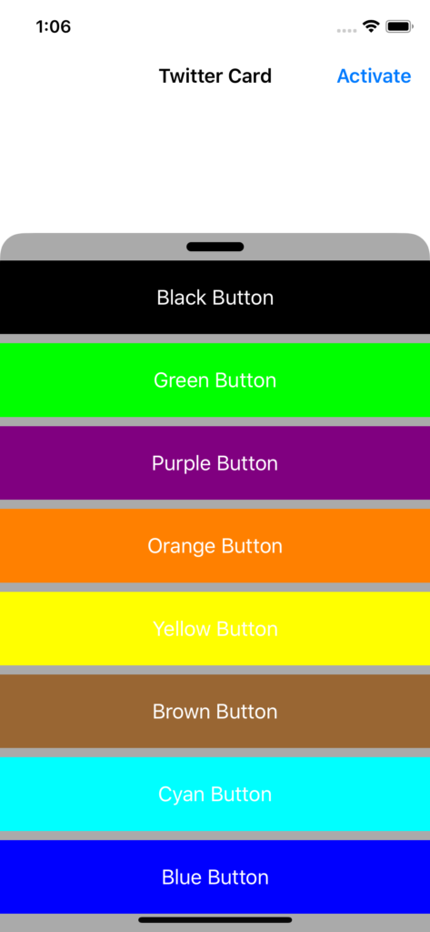
The gestures still work seamlessly. And you can see list of buttons equally populating the defined space on the Card view. We didn’t need to set up constraints on individual buttons and using subclasses, we were also able to make multiple buttons really quickly without having to write same line of codes each time.
I am just scratching the surface of UIStackView here. You can create beautiful and complex designs just by using StackViews. I hope you found this tutorial helpful.
Follow me on Twitter. I write articles on Swift and Algorithms on a weekly basis!