Making an Interactive Card based UI using Swift (Part 1/2)
Most apps nowadays use this card based UI to pop up information or show an action menu etc. Twitter, Instagram, Facebook all are using some sort of a multi-state, interactive, gesture based card flow to show information to users. I have always been intrigued by such a design element and thought I should try building one from scratch.
While building this, I also wanted to make sure that I make this in such a way that people could use it. As in if I ever want to release this as a framework, I could easily do it. So while I have not released this project as a framework, I have tried to code it in such a way to practice framework building skills and make it reusable.
 The entire project is available on my Github here.
THE IDEA:
The whole project revolved around how reusable, and quickly a user can set up a card UI. There were few principles that this project had to follow:
- Make sure that the configuration and set up is quick.
- User should get two options. Segmented(multi states) or non segmented(dual states). (more on this later)
- Granular control over card visible height for each state.
- The gestures need to be smooth and intuitive / animating the background alpha values as well.
- The ability to show the card floating at the bottom as a closed state. (Something we see in Maps app, Uber etc)
- The ability to detect a scrollView inside the controller and switch between scrollView & Pan Gesture recognizer at right times.
So let’s get started. First we will create couple of protocols. The first protocol we will create is called: Glideable. This Glideable protocol contains only one property which is headerHeight.
protocol Glideable: class {
    var headerHeight: CGFloat { get set }
}
Any View controller that conforms to the Glideable protocol could be used as the card View Controller. The headerHeight allows user to set a visible height for the card view controller. So if you want the card to float around at the bottom then use this property to provide the visible height for the card.
The next protocol we will create is called GlideConfiguration. This protocol will contain all the necessary protocols required to set up and customize the entire Glide animation. For now this protocol will only have four properties.
protocol GlideConfiguration : class {

    /// When Segmentation Enabled, you get three States
    ///Open - Max Height
    ///Compressed - Intermediate Height
    ///Closed - Min Height of the card
    var segmented: Bool { get }

    ///When Segmentation is ENABLED
    ///A dictionary that takes the state enum (.open, .compressed, .closed) & corresponding heights
    var segmentHeightDictionary: \[State: CGFloat\] { get }


    ///If Segmentation is turned OFF
    ///Assign a concrete height to the card. It can be:
    ///Fullscreen - Takes the fullscreen of the parent view
    ///Half - half of the parent view
    ///OneFourth - 1/4 of the parent view
    ///OneThird - 1/3 of the parent View
    ///Custom - Give a custom dimension and it should open till that point.

    //Concrete Dimensions only have two states - close(0 or headerHeight) or opened (selected from above options)
    var concreteDimension: GlideConcreteDimension { get }


    //To show a grey handle top indicate this is a card/ interactable
    var popUpIndicator: Bool { get }

}
This properties have been explained through the comments in the above code snippet but I will explain them again here:
Segmented: When enabled, it will allow users to have three states. Close, Compressed & Open. When disabled: only two states will be available. Close & Open.
SegmentHeightDictionary: This is a dictionary that requires the state and the height for that state. The key for this dictionary is “State” enum that has three cases: .open, .compressed & .closed. The values for each key is a CGFloat.
ConcreteDimension: When the segmented bool is false, then a dimension needs to be given to which the card needs to open. This could be one of the preselected enum cases (fullscreen, half, onefourth, onethird) or it could be custom - so just provide a custom CGFloat number.
popUpIndicator: This provides a grey colored handle top of the card view controller just to indicate that this view is draggable.
Next let’s talk about the Glide class. The Glide class is created in such a manner so as to provide a one line setup to the developer. So if you want to set up a new glide manager class this is how it should go:
var glideManager : Glide!
glideManager = Glide(parentViewController: self, configuration: glideConfig, card: cardController)
Just created a Glide property and initialize the object using a simple initializer that takes in the parent view controller, the configuration file which is of GlideConfiguration protocol type and the view controller that needs to be of type Glide.
Let’s take a look at how the Glide class works. This class is pretty much doing the heavy lifting for us. This is where the whole logic sits in. From setting up the card view controller and the parent view controller, to animations, to different configuration options etc.
We will divide this class in to three components:
1. Setting up the parent view controller/Window and the card view controller:
private var configuration: GlideConfiguration!
private weak var parentViewController: UIViewController?
private var card: (Glideable & UIViewController)?
First thing I have done is to declare three properties. c_onfiguration_ - for the GlideConfiguration, parentViewController - UIViewController type and then card which is of type Glide and UIViewController. In the initializer we are setting these properties.
self.parentViewController = parentViewController
self.configuration = configuration
self.card = card

Next we will add the card to the container or the parentViewController. To do this I have created couple of function just to make the code readable and easier to understand.

    private func setupPreviewLayer(parentViewController: UIViewController, cardViewController: UIViewController) {
        window = UIApplication.shared.keyWindow!

        blackView.backgroundColor = UIColor.black
        blackView.alpha = 0
        window.addSubview(blackView)
        blackView.frame = window.frame

        blackView.addGestureRecognizer(UITapGestureRecognizer(target: self, action: #selector(handleTapRecognizer)))
        window.addSubview(cardViewController.view)
        showPopUpIndicator()
    }
In this function, I am taking two parameters, parentViewController and the cardViewController. Even though I am only adding the cardViewController to the UIWindow and not the parentViewController - however if you want to change things up and add the card on the parentVC directly you can do it as well. Then you may ask why are we using the parentVC? We will use it further in the code for sizing and dimensions.
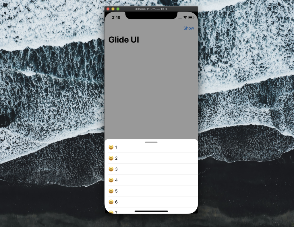
So in this function we are creating a window, adding a UIView named as blackView on the window and setting the frame of the UIView as that of the whole window. Then I am adding the gesture recognizer on the blackView and adding the cardViewController’s view as a subview to the window. This gesture recognizer is mainly to dismiss the card when the user taps elsewhere. So essentially what we get here is a blackView with alpha = 0 but this will be animated to a different value in order to dim the background when the card is enabled or showing. As shown in the picture below.
2. Card View Controller States and Dimensions:
This next function will be used to add constraints to the card view controller’s view.
    private func addChildToContainer(containerView: UIView, card: UIView) {
        guard let safeAreaLayout = UIApplication.shared.keyWindow?.safeAreaLayoutGuide.layoutFrame.height else { return }
        guard let bottomAreaInset = UIApplication.shared.keyWindow?.safeAreaInsets.bottom else { return }

        ///Calculating Segment Heights if Segmentation is enabled in Configuration file
        calculateSegmentHeights()

        ///The headerheight is over written if segmentation is enabled
        ///Segmentation closed height then becomes the headerHeight
        let visibleHeight = configuration.segmented ? (calculatedSegmentHeightsDictionary\[.closed\] ?? 0) : (safeAreaLayout + bottomAreaInset - (self.headerHeight ?? 0))

        card.translatesAutoresizingMaskIntoConstraints = false

        cardTopAnchorConstraint = card.topAnchor.constraint(equalTo: window.safeAreaLayoutGuide.topAnchor, constant: visibleHeight)
        card.leadingAnchor.constraint(equalTo: window.leadingAnchor).isActive = true
        card.trailingAnchor.constraint(equalTo: window.trailingAnchor).isActive = true
        card.bottomAnchor.constraint(equalTo: window.bottomAnchor).isActive = true
        cardTopAnchorConstraint.isActive = true

    }
The function starts with first getting the safeAreaLayout - this essentially caters for the status bar, the home bar at the bottom and more. So after we get these two properties we get call a new function called calculateSegmentHeight.
Let’s take a look at this function now:
In the configuration file of the Glide we have few options that the developer can set. One of them is segmented. This is a bool value that lets user add states to the card flow. So we have .open, .compressed, .closed. So if the user has enabled this option we need to carefully set up the dimension of the card’s closed/open/compressed state. This calculation is done here but will be used in the animation stage of the class where we need these values to animate the card to different state values.
    private func calculateSegmentHeights() {
        guard let safeAreaLayout = UIApplication.shared.keyWindow?.safeAreaLayoutGuide.layoutFrame.height else { return }
        guard let bottomAreaInset = UIApplication.shared.keyWindow?.safeAreaInsets.bottom else { return }

        if configuration.segmented {
            let segmentationHeights = configuration.segmentHeightDictionary
            guard let compressedHeight = segmentationHeights\[.compressed\] else {
                print("No Compressed Heights Available in Configuration File")
                return
            }
            guard let openHeight = segmentationHeights\[.open\] else {
                print("No Open Heights Available in Configuration File")
                return
            }

            guard let closeHeight = segmentationHeights\[.closed\] else {
                print("No closed Heights Available in Configuration File")
                return
            }

            let compressedStateConstraintConstant = (safeAreaLayout + bottomAreaInset - compressedHeight)
            let openStateConstraintConstant = (safeAreaLayout + bottomAreaInset - openHeight)
            let closedStateConstraintConstant = (safeAreaLayout + bottomAreaInset - closeHeight)

            calculatedSegmentHeightsDictionary\[.compressed\] = compressedStateConstraintConstant
            calculatedSegmentHeightsDictionary\[.open\] = openStateConstraintConstant
            calculatedSegmentHeightsDictionary\[.closed\] = closedStateConstraintConstant
        }
    }
So in this method we are again grabbing the safeAreaLayout and bottomAreaInset heights. Then we access the configuration file which was passed to this class through the initializer and check if the segmented bool is true or false. If it is true, then we grab the values provided to us by the configuration file of the closed / compressed and open state. This is passed through a dictionary. Essentially we are just getting the segmentationHeights for respective states and saving them to the compressedHeight, openHeight and closeHeight. Then we are calculating the constraint constants catering for the bottomAreaInset and the safeAreaLayout height and saving it to calculatedSegmentedHeightsDictionary property.
Going back to the initial function, the next line states the visible height of the card. This visible height is the height that the developer sets initially when the cardViewController conforms to the Glideable protocol.
Do note here that when the segmentation is enabled, this visibleHeight property is overridden. So in order to get visible card showing at the bottom even when the segmentation is enabled, add some height to the .closed state in segmentHeightsDictionary in the configuration file.
Then we are simply setting up the auto layout constraints of the card view over the UIWindow and making sure that we can access the top constraint by storing it in a NSLayoutConstraint property named: cardTopAnchorConstraint.
3. Animating the cards:
Let’s add a pan gesture recognizer to the cardViewController.
gestureRecognizer = UIPanGestureRecognizer(target: self, action: #selector(handlePanRecognizer(recognizer: )))
gestureRecognizer.delegate = self
card.addGestureRecognizer(gestureRecognizer)
In the handlePanRecognizer method we are basically checking the recognizer state and doing setting the card’s constraint constant.
switch recognizer.state {

             case .began:
                 startingConstant = (cardTopAnchorConstraint?.constant)!
             case .changed:

                 let translationY = recognizer.translation(in: card.view).y

                 if self.startingConstant + translationY > 0 {
                   self.cardTopAnchorConstraint!.constant = self.startingConstant + translationY
                    blackView.alpha = dimAlphaWithCardTopConstraint(value: cardTopAnchorConstraint!.constant)
                 }

             case .ended:


                let velocityY = recognizer.velocity(in: card.view).y
                let topAnchorConstant = configuration.segmented ? calculatedSegmentHeightsDictionary\[.compressed\]! : configureCardSize(parentView: container, configuration: configuration)

             if cardTopAnchorConstraint!.constant < topAnchorConstant { if velocityY > 0 {
                     //card moving down
                     showCard(state: .compressed)
                 }else {
                     //card moving up
                     showCard(state: .open)
                 }


             } else if cardTopAnchorConstraint!.constant < (safeAreaLayout) { if velocityY > 0 {
                     //Card moving down
                      showCard(state: .closed)
                 }else {
                     //card moving upwards
                    configuration.segmented ? showCard(state: .compressed) : showCard(state: .open)
                 }
             }else {
                 dismissCard()
             }

             default:
                 break
             }
In this switch statement we are checking the state of the gesture, be that .began, .changed & .ended. In the began block, we are first storing the constraint value of the card to a property called startingConstant. In the changed block, we are using the translation property of the pan recognizer to detect how much the user has swiped on the card. This value is stored in translationY property. Then in the if block I am checking if the translationY + startingConstant is greater than 0. If it is then that means the card is moving upwards. So in order to respect this, we will add the translationY to the startingConstant and assign it as a constant to the card constraint. We are also setting the alpha value of the blackView with a special function but I will talk more on this later.
Similarly in the .ended case we will check the velocity of the swipe as it ended. So basically this means when the user stopped the gesture, was the card going upwards or downwards? We can get this from using recognizer .velocity property.
let topAnchorConstant = configuration.segmented ? calculatedSegmentHeightsDictionary\[.compressed\]! : configureCardSize(parentView: container, configuration: configuration)In this line, we are checking if the segmentation is enabled or not? If it is enabled then we grab the .compressedheight from the calculatedSegmentHeightsDictionary which we have created earlier, if the configuration.segmented is false then a new function called configureCardSize is called that grabs the card size which the user has put in the configuration file. Let’s talk about this configurationCardSize function:
  private func configureCardSize(parentView: UIView, configuration: GlideConfiguration) -> CGFloat {
        return configuration.concreteDimension.translateView(containerView: parentView, navControllerPresent: true)
     }
This code accesses the configuration file’s concreteDimension enum. This enum consists of five cases and a translateView function.
enum GlideConcreteDimension {
    case fullScreen
    case half
    case oneFourth
    case oneThird
    case custom(CGFloat)

    func translateView(containerView parent: UIView, navControllerPresent: Bool) -> CGFloat {
        switch self {
        case .fullScreen:
            let parentHeight = parent.bounds.height
            var constraintConstant: CGFloat = 0
            let navBar: CGFloat = navControllerPresent ? 44 : 0
            constraintConstant = navBar
            return constraintConstant
        case .half:
            return (parent.bounds.height - parent.bounds.height / 2)
        case .oneFourth:
            return (parent.bounds.height - parent.bounds.height / 4)
        case .oneThird:
            return (parent.bounds.height - parent.bounds.height / 3)
        case let .custom(height):
            return (height > parent.bounds.height) ? parent.bounds.height: (parent.bounds.height - height)
        }
    }
}
So in the configuration file the user has to give a concrete dimension if the segmentation is disabled. In the enum the user can select from four basic options and one custom option. So the user can provide a custom height value and the card will be opened till that position. In the translateView function the respective heights are found with respect to the parentViewController’s view. With this the navigation bar will not be fully covered if the developer selects the .fullScreen option as the height now solely depends on the parent View Controller’s view.
If segmentation is enabled and concrete dimension is also given, the segmentation will take precedence.
Heading back to the pan gesture recognizer method, inside the changed state, once we have the topConstraint constant for the card we need to decided whether we should now change the card constraint depending upon the current constraint value. If the current value of the card constraint is less than what we calculated above and the velocity of the swipe is also moving down then then that means the card is above the compressed state and should be opened to the compressed state.
if cardTopAnchorConstraint!.constant < topAnchorConstant {
  if velocityY > 0 {
       //card moving down
     showCard(state: .compressed)
 }else {
     //card moving up
     showCard(state: .open)
 }
The showCard function gets the .compressed state and will animate the card. If the velocity of the gesture is upwards when it ended, then this means the card was swiped all the above the compressed state threshold and will since the velocity’s direction was upward, the card should continue to open and reach the .open state.
else if cardTopAnchorConstraint!.constant < (safeAreaLayout) {

if velocityY > 0 {
    //Card moving down
     showCard(state: .closed)
}else {
      //card moving upwards
      configuration.segmented ? showCard(state: .compressed) : showCard(state: .open)
  }
}else {
   dismissCard()
}
If the card’s constraint is below the compressed state threshold then again we check the velocity of the gesture and if it is moving down, then the card shown be in the .closed state or dismissed else the card should keep moving upwards but either go the compressed state or the open state depending on the configuration file and if the segmentation is enabled or not.
In part 2 we will take a look at the actual animation code and then will look at how to detect/handle a scrollView inside the card view controller, and how to animate the alpha value as well as the user swipes on the card.
The full project is available here on my Github.